Responsive Navigation Bar With Flexbox
This is a guide to building a navigation element that responds to the width of the device it’s being viewed on. Flexbox is a CSS method for building one dimensional layouts.
So we’ve been tasked with building the a navigation menu that sits at the top of the index page for ABC Inc a fictional company that sells various obscure products. They want the navigation to be full width when their users visit their site on a laptop or desktop but when their users are on a mobile device they want the navigation items to be hidden and to be activated with a toogle button. This way they improve the usability of their site. This is the core of responsive web design, building sites that respond to the users device. Using the best practice of mobile first design, we’ll be using a mobile first approach.
We’ll start with a basic HTML structure including the viewport meta tag.
<!DOCTYPE html>
<head>
  <meta name="viewport" content="width=device-width, initial-scale=1">
</head>
<body>

</body>
</html>
Now we’ll add our top bar navigation which is as simple as it can be. A single nav element with each navigation item a div element.
<nav>
  <div>ABC Inc</div>
  <div>Product</div>
  <div>Features</div>
  <div>Add-Ons</div>
  <div>Blog</div>
  <div>Contact</div>
</nav>
We’ll add these initial style rules in a separate stylesheet.
body {margin:0;}

nav {
  display: flex;
  flex-direction: column;
  background-color: #41244b;
  color: white;
}

div {
  padding: 10px;
}
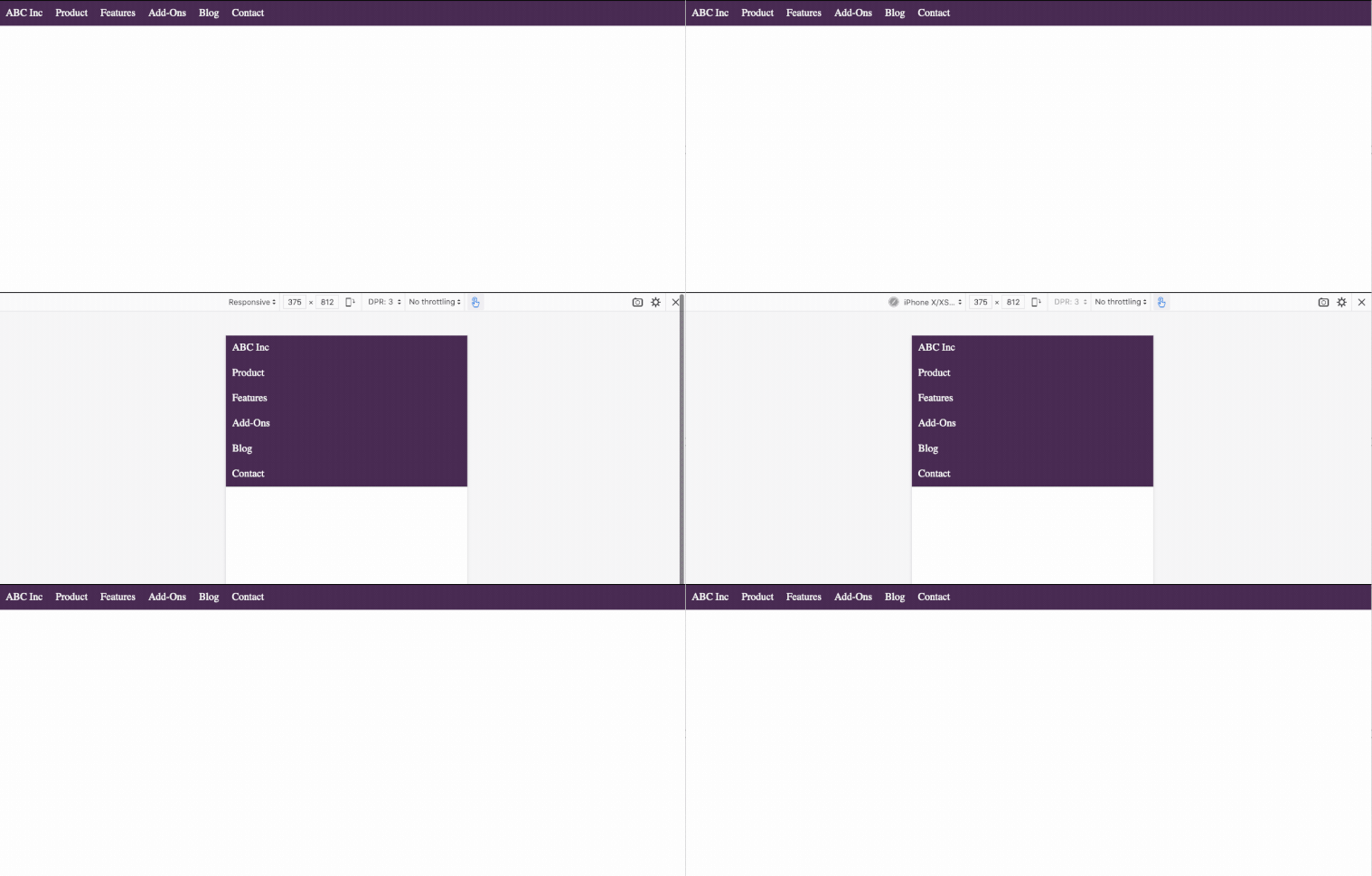
And now we navigation items in a column top down style, the base for our navigation in mobile view.
To make the navigation expand horizontally when viewed on a larger device we’ll add some styles that only apply to large view port sizes with the media query technique.
@media (min-width: 1025px) {
  nav {
    flex-direction: row;
  }
}
So now we have a responsive navigation that on mobile is vertical and on larger devices is horizontal.

The head honcho at ABC Inc is not that impressed though. He want’s the navigation in mobile view to be hidden by default and the users should have some way of opening the navigation when needed rather than taking up valuable screen space.
The first step in doing that is by adding an icon inside the first navigation item. This icon will be the button that users will click to open the navigation in mobile view.
<nav>
  <div>
    ABC Inc
    <i class="fas fa-bars"></i>
  </div>
  <div>Product</div>
  <div>Features</div>
  <div>Add-Ons</div>
  <div>Blog</div>
  <div>Contact</div>
</nav>
I got my icon from font awesome, just sign-up and you’ll get a unique link you can stick in the head of your site and you’ll have all their icons available.
<script src="https://kit.fontawesome.com/xxxxxxx.js" crossorigin="anonymous"></script>
To recap our HTML now looks like this:
<!DOCTYPE html>
<head>
  <meta name="viewport" content="width=device-width, initial-scale=1">
  <link rel="stylesheet" href="styles.css">
  <script src="https://kit.fontawesome.com/xxxxxxx.js" crossorigin="anonymous"></script>
</head>
<body>
  <nav>
    <div>
      ABC Inc
      <i class="fas fa-bars"></i>
    </div>
    <div>Product</div>
    <div>Features</div>
    <div>Add-Ons</div>
    <div>Blog</div>
    <div>Contact</div>
  </nav>
</body>
</html>
Now to get our icon to display oppsite the navigation items we’ll make the first navigation item a flexbox container. By adding space-between this forces the two items apart using the available space. For our desktop view though we’ll have to revert that and set the display to block.
div:nth-of-type(1) {
  display: flex;
  flex-direction: row;
  justify-content: space-between;
}

@media (min-width: 1025px) {
  div:nth-of-type(1) {
    display: block;
  }
}
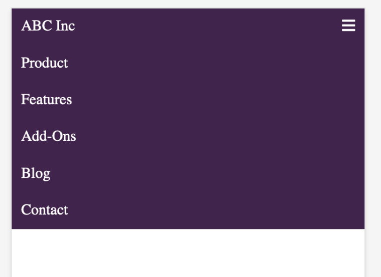
We now have our icon on the opposite side to our text items.

Users on desktop don’t want to see our icon so we’ll hide it for them inside the media query again.
@media (min-width: 1025px) {
  i.fa-bars {
    display: none;
  }
}
To add some more complexity our customer at at ABC Inc now wants to have the last two navigation items on the right side of the screen on desktop. Fortunately we’re using flexbox so that shouldn’t be too hard. We’ll just select the 5th item and push it all the way to the right.
div:nth-of-type(5) {
  margin-left: auto;
}

So now to make the icon actually work we’ll use some JavaScript. First we add a console log for debugging, then we select all the div elements which are all our navigation items. We then iterate over each of the items and toggle a class of show. So the first time the icon is clicked the class will be added then the next time it’s clicked it will be removed. The last thing this script does is to add an event that listens for the click to our icon. We’ll add this JS to a separate file and link to it just like our CSS.
function toggle() {
  console.log('toggle activated');

  navItems = document.querySelectorAll('div');

  navItems.forEach( nav => nav.classList.toggle('show') );
}

document.querySelector('.fa-bars').addEventListener('click', toggle);
The last thing we have to do is to define the show style rule. So what this does is select the second to the sixth div elements, in effect all our navigation items appart from the first one. We hide them by default buy show them when they have a class of show.
div:nth-child(n+2):nth-child(-n+6) {
  display: none;
}

div.show:nth-child(n+2):nth-child(-n+6) {
  display: block;
}
So let’s recap before we test the fully working version. Our HTMl should be like this:
<!DOCTYPE html>
<head>
  <meta name="viewport" content="width=device-width, initial-scale=1">
  <link rel="stylesheet" href="styles.css">
  <script src="https://kit.fontawesome.com/xxxxxxx.js" crossorigin="anonymous"></script>
</head>
<body>
  <nav>
    <div>
      ABC Inc
      <i class="fas fa-bars"></i>
    </div>
    <div>Product</div>
    <div>Features</div>
    <div>Add-Ons</div>
    <div>Blog</div>
    <div>Contact</div>
  </nav>
</body>
<script src="top-nav.js"></script>
</html>
Our CSS should look this this:
body {margin:0;}

nav {
  display: flex;
  flex-direction: column;
  background-color: #41244b;
  color: white;
}

div {
  padding: 10px;
}

div:nth-of-type(1) {
  display: flex;
  flex-direction: row;
  justify-content: space-between;
}

div:nth-child(n+2):nth-child(-n+6) {
  display: none;
}

div.show:nth-child(n+2):nth-child(-n+6) {
  display: block;
}

i.fa-bars {
  cursor: pointer;
}

@media (min-width: 1025px) {
  nav {
    flex-direction: row;
  }

  div:nth-of-type(1) {
    display: block;
  }

  div:nth-of-type(5) {
    margin-left: auto;
  }

  div:nth-child(n+2):nth-child(-n+6) {
    display: block;
  }

  i.fa-bars {
    display: none;
  }
}
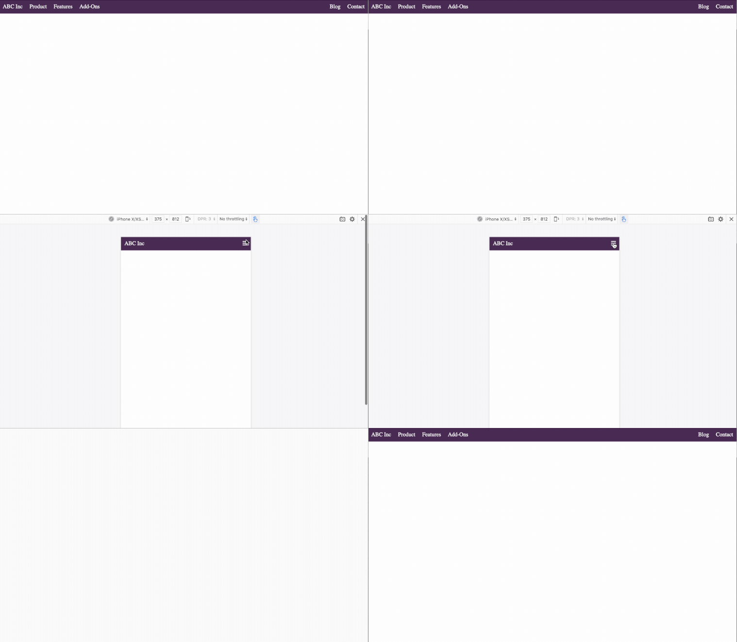
The finished code should have produced this responsive top navigation bar.

If you’re looking to master flexbox, we recommend Flexbox Zombies. To find out more about about flexbox checkout CSS Tricks, A Complete Guide. Find great icons at Font Awesome. Thanks to Charlie Waite who was the inspiration behind this post.
If you’re looking for a complete cloud based NDT reporting solution which incorporates customer access as standard and can help you streamline and improve your reporting processes, consider Agile NDT and contact us for a free no obligation consultation.

Since 2011 we've been building cloud based reporting software for the NDT industry.
© 2025 Rebel Colony Ltd. Agile NDT is a service offered by Rebel Colony Ltd, a company registered in Scotland (SC570568). 10 Knockbreak St, Tain, IV19 1BJ, United Kingdom
